How Feedback Shapes Financial Dashboard Design
How Feedback Shapes Financial Dashboard Design
Want better financial dashboards? Start with user feedback.
Here’s why feedback is essential and how it improves dashboard design:
- Simplifies Workflows: Users identify bottlenecks and inefficiencies.
- Prioritizes Key Metrics: Feedback helps focus on the most relevant data for specific roles, like traders or analysts.
- Enhances Visual Clarity: Testing shows which visuals are easiest to understand under pressure.
Common Issues Feedback Can Solve:
- Information Overload: Too much data clutters the screen and overwhelms users.
- Missing Features: Different roles need tailored tools, like price alerts for traders or trend summaries for executives.
- Data Delays: Real-time updates are critical - delays can lead to poor decisions.
Solutions:
- Use rating systems and usage data to gather actionable insights.
- Test new layouts with A/B testing to improve usability.
- Integrate reliable APIs like OilpriceAPI for fast, real-time data updates.
Bottom Line: User feedback fine-tunes dashboards, ensuring they’re clear, fast, and tailored to user needs. Start listening to your users today.
AI Dashboard Review: Feedback In Minutes
Common Problems in Financial Dashboard Design
Users of financial dashboards often encounter issues that make decision-making and market analysis harder than it needs to be. Recognizing these problems is the first step toward creating better tools that meet user needs.
Information Overload in Data Display
Too much data on a single screen can overwhelm users, making it hard to focus on what matters. Cluttered layouts can lead to missed opportunities. For instance, commodity traders juggling multiple price feeds might struggle to spot key changes if the dashboard isn't well-structured or intuitive.
Missing Job-Specific Features
Different roles require different tools, and a lack of tailored features can disrupt workflows. Here’s a breakdown:
| Role | Missing Features | Impact on Work |
|---|---|---|
| Traders | Custom price alerts, quick-action buttons | Slower responses to market changes |
| Analysts | Advanced charting, historical comparisons | Gaps in market analysis |
| Executives | High-level summaries, trend indicators | Poor decision-making efficiency |
On top of these gaps, slow updates can make real-time decision-making nearly impossible.
Delays in Live Data Updates
When price updates are delayed, users are forced to act on outdated information. For financial dashboards, updates should occur every 5 minutes, with response times under 115 ms and uptime at 99.9%. This is especially important for volatile markets where even small delays can lead to missed trades or flawed analysis.
To tackle these challenges, dashboards need better data visualization, role-specific customization options, and reliable infrastructure for real-time updates. Gathering direct user feedback can help designers identify and fix the most pressing issues, ensuring the tools truly meet user demands.
Using Feedback to Fix Dashboard Issues
After identifying design challenges, gathering and analyzing user feedback can help address problems like information overload, missing features, and update delays.
Built-in User Rating Systems
Rating systems are a great way to collect both numerical and written feedback. Here’s how they can work:
| Feedback Component | Purpose | How It Works |
|---|---|---|
| Feature Ratings | Assess specific tools | Star ratings with hover tooltips |
| Task Completion | Measure success rates | Yes/No prompts after key tasks |
| Comment Fields | Collect detailed feedback | Context-specific forms for user input |
Adding short post-task surveys can also collect feedback without interrupting the user experience.
Finding Problems Through Usage Data
Usage data can highlight how users interact with the dashboard. Key metrics to monitor include:
- Time-to-task completion: How long users take to find specific information.
- Feature adoption rates: How often tools or features are used.
- Error patterns: Areas where users frequently run into issues.
- Session duration: How much time users spend in different sections of the dashboard.
For example, if users spend too much time searching for price data, it might signal that navigation needs improvement.
Testing Different Dashboard Layouts
Feedback can guide layout adjustments, and A/B testing helps confirm whether these changes work effectively.
1. Focus on One Change at a Time
Test single layout adjustments to measure their impact clearly.
2. Set Clear Success Metrics
Track measurable outcomes like:
- Faster task completion times
- Fewer user errors
- Higher satisfaction scores
- Increased use of specific features
3. Use Representative Sample Groups
Test with diverse user groups to ensure results are meaningful.
Introduce changes gradually to maintain familiarity while improving usability.
sbb-itb-a92d0a3
Using APIs for Better Market Data
Integrating reliable APIs into dashboards ensures they deliver accurate, real-time data alongside user-friendly interfaces. For financial dashboards, dependable market data APIs are crucial for making quick, informed decisions.
Connecting OilpriceAPI to Dashboards
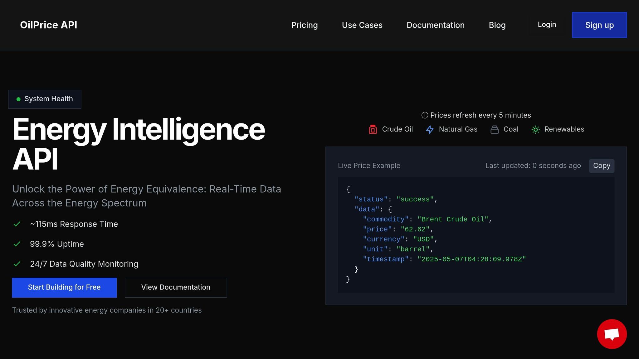
The success of a dashboard hinges on how accurate and timely its data is. OilpriceAPI offers dependable market data, ideal for financial dashboards:
| Performance Metric | Specification | Impact on Dashboards |
|---|---|---|
| Update Frequency | Every 5 minutes | Enables real-time tracking |
| Response Time | ~115 milliseconds | Minimizes delays |
| Uptime Guarantee | 99.9% | Ensures reliability during market hours |
| Data Coverage | Brent, WTI, Natural Gas, Gold | Provides a broad market perspective |
Built on a REST architecture, OilpriceAPI simplifies integration, allowing developers to focus on creating effective visualizations rather than dealing with complex backend systems.
Setting Up Custom Price Alerts
Price alerts keep users updated on market changes without needing to constantly monitor dashboards. Here’s how to implement them effectively:
- Define Alert Parameters: Alerts should be based on absolute price thresholds or percentage changes. With a 5-minute refresh rate, users get timely updates on significant market moves.
- Configure Data Streams: OilpriceAPI’s continuous monitoring ensures accurate alerts, reducing the risk of false notifications while keeping users informed about critical price shifts.
These features ensure users receive precise, actionable alerts without unnecessary noise.
Maintaining Fast Data Delivery
Fast access to data is essential for making real-time decisions. OilpriceAPI’s performance metrics highlight its ability to support responsive dashboards:
"Real-Time Updates: Get the latest oil and gold prices as they change." - OilPrice API
To maintain dashboard speed and reliability:
- Use caching to reduce redundant API calls
- Monitor and optimize API response times
- Set up redundancy and failover systems for uninterrupted service
With a ~115ms response time and 99.9% uptime, OilpriceAPI supports dashboards that can handle the demands of active trading. These strategies ensure users have the tools they need to act quickly and confidently.
Conclusion: Building Better Dashboards Through User Input
Creating effective financial dashboards relies on consistently gathering and acting on user feedback. By systematically collecting and analyzing this input, organizations can design tools that align with user needs.
Testing based on feedback helps fine-tune interfaces, striking the right balance between clarity and usability. This process ensures dashboards support efficient market analysis and decision-making.
Accurate and timely data sources, such as OilpriceAPI, play a key role in enabling fast, informed decisions.
"Unlock the Power of Energy Equivalence: Real-Time Data Across the Energy Spectrum" - OilPrice API
To maintain high standards and address challenges effectively, organizations should focus on:
- Regularly monitoring user engagement metrics
- Integrating user feedback into feature updates
- Upholding strict data quality with constant monitoring
The best dashboards combine intuitive design with reliable data, making them indispensable tools for market analysis. Keeping an open line of communication with users and leveraging dependable APIs like OilpriceAPI ensures dashboards stay relevant and adapt to evolving market demands.
FAQs
How does user feedback help reduce information overload on financial dashboards?
User feedback plays a crucial role in minimizing information overload on financial dashboards by identifying what data is most important to users. It helps designers understand which metrics, visuals, and features are essential, allowing them to simplify the layout and prioritize clarity.
By incorporating user suggestions, dashboards can be tailored to present only relevant information, reducing unnecessary complexity and improving usability. This ensures users can quickly access the insights they need without feeling overwhelmed by excessive data.
How can financial dashboards use real-time data updates to improve decision-making?
Real-time data updates are essential for financial dashboards to provide accurate and timely insights. By integrating reliable data sources, such as APIs offering live commodity price updates, users can monitor market changes as they happen and make informed decisions.
For example, accessing up-to-date prices for Brent Crude, WTI, Natural Gas, or Gold ensures that your dashboard reflects the latest market conditions. This level of precision is crucial in dynamic industries where decisions often rely on the most current information available. Implementing real-time updates not only enhances usability but also empowers users to act quickly and confidently.
How does A/B testing help improve the usability of financial dashboards using user feedback?
A/B testing is a powerful tool for refining financial dashboards by comparing two versions of a design to see which performs better. By gathering user feedback on key elements - such as data visualizations, layout, or navigation - you can identify what works best for your audience.
For example, you might test different ways of displaying real-time commodity prices like Brent Crude or WTI to ensure users can quickly interpret the data. Regularly incorporating feedback through A/B testing helps optimize usability, making dashboards more intuitive and effective for decision-making.